|

DESIGNED
IN ASSOCIATION
WITH

|
Background
 The changing shape of the railways
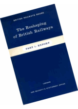
The Transport Act 1947 passed by Clement Attlee's Labour Government, made provision for the nationalisation of Britain's railway network and at midnight on 1 January 1948, the British Transport Commission (BTC) took over the assets of the so-called 'Big Four' railway companies and British Railways was born. The financial position of British Railways was to gradually worsen until its first operating deficit was recorded in 1955. By 1960 British Railways was beginning to suffer heavy losses and both passenger and freight traffic were in sharp decline, due in no small part to the rapidly improving road network and the increasing popularity of the motor car, a convenient and affordable alternative to rail travel. The Transport Act 1962 passed by Harold Macmillan's Conservative government led to the creation of the British Railways Board (BRB) on 1 January 1963, the successor to the Railway Executive of the BTC. Richard Beeching was appointed its first chairman and tasked with finding ways to reverse the fortunes of the railways. While Beeching may be best remembered for his report The Reshaping of British Railways (more commonly referred to as the 'Beeching Report') and the subsequent closure of a quarter of the railway network, he supervised the BRB's Design Panel (originally set up by Sir Brian Robertson in 1956), a working party consisting of industrial designers and members of British Railways staff, now chaired by Milner Gray. The panel was in agreement that the basic feature still lacking on the railways in Britain was a cohesive and universal house style. Following the Board's approval, an internal steering committee was formed to focus on the development and implementation of a new visual style.
 A new corporate identity for a new era
In 1964 Design Research Unit—Britain's first multi-disciplinary design agency founded in 1943 by Misha Black, Milner Gray and Herbert Read—was commissioned to breathe new life into the nation's neglected railway industry, the corporate image of which had remained largely unchanged after its nationalisation in 1948, a reflection of a largely disjointed and out-of-date transport system. The company name was shortened to British Rail and Gerry Barney of Design Research Unit conceived the famous 'double-arrow', a remarkably robust and memorable icon that has far outlasted British Rail itself and continues to be used on traffic signs throughout the United Kingdom as the symbol for the national rail network and more specifically railway stations on that network. The new corporate identity programme was launched in January 1965 with an exhibition at the Design Council, London. The corporate identity consisted of four basic elements: the new symbol, the British Rail logotype, the Rail Alphabet typeface and the house colours. Initially 750 copies of Binder 1 of the British Rail Corporate Identity Manual were released across the company. There were four volumes which were supplemented over the course of time by over 2,000 individual information sheets, dealing with all aspects of the application of the brands of British Rail and its subsidiaries.
|
|
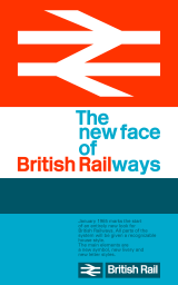
Launch poster for the new British Rail Corporate Identity as seen at the 1965 exhibition at the Design Council, London
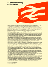
Introduction to British Railways Board Corporate Identity Design Elements folder from the Director of Industrial Design c.1989.
|

