|

DESIGNED
IN ASSOCIATION
WITH

|
Rail Alphabet
 Transport
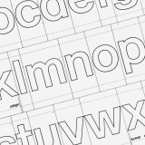
At the heart of the British Rail Corporate Identity stands Rail Alphabet, a paragon of 20th Century design. This bespoke sans serif typeface was devised in 1964 by eminent duo Jock Kinneir and Margaret Calvert. Kinneir, an expert in the field of lettering and legibility, together with assistant designer Calvert, had devised the lettering for the Ministry of Transport's ubiquitous traffic signs first seen publicly on Britain's first stretch of motorway, the Preston bypass, which opened in December 1958. Their solution was Transport, a curvy sans serif loosely based on Akzidenz-Grotesk. The design was put through rigorous legibility tests at the Road Research Laboratory and overcame strong competition from a slab-serif solution by David Kindersley, due in part to the theory that words set in upper and lower case are significantly easier to read at distance than their upper case counterparts. The letters were sensitively crafted and precisely spaced—each character positioned on an individual tile of fixed width—and two weights were drawn for use on both light and dark backgrounds.
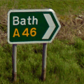
It was the British Rail Design Panel's original intention was to use the same typeface for British Rail. Transport was tested in a number of railway environments, for example, the continuous platform facia signage at Coventry station. Nevertheless it was suggested by Kinneir and Calvert that, because the original performance requirements of the typeface were very different—being able to quickly read a legend at long distance whilst driving at high speed is by no means the same proposition as effective wayfinding in a pedestrian context—a sans serif much closer to the neo-grotesque Helvetica model should be used for British Rail signage.
 Inspiration from the hospital
Kinneir and Calvert had been working on one such alphabet for the National Health Service (on behalf of the Department of Health and Social Security) designed specifically for wayfinding in hospitals. When tasked with providing a typeface for British Rail, they saw no reason not to employ the same design. It was modern, clean, efficient; everything British Rail aimed to be. Its hallmarks were simplicity and clarity. The characters have an overwhelmingly unpretentious and neutral—some may say dull—feel, following in the footsteps of the Continental typographic traditions of the late 1950s. However Kinneir and Calvert instilled their own unique character and charm into the typeface, deviating from Helvetica in the direction of Akzidenz-Grotesk whenever there was deemed to be a conflict in legibility between different characters. They also remained utterly committed to their previously tried and tested methods of spacing the characters using their groundbreaking but straightforward tiling system which meant that even untrained staff had a reasonable chance of assembling correctly spaced signs.
 Optical features
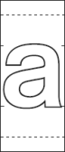
Rail Alphabet exists in both positive and negative weights which have been adjusted to counter the effect of halation (an optical phenomenon whereby light spreads beyond its proper boundaries) and thus give visual equality of character. Rail Alphabet 1 (represented by the outer edge of the outline of each character) is used only for dark lettering on a light background. Rail Alphabet 2 (represented by the inner edge of the outline of each character) is used only for light lettering on a dark background. It is worth noting that tile sizes are identical for both alphabets; the dimensions of any given legend are therefore identical, regardless of which version is used. The typeface is measured over x-height (the height of the lower case x). The distance between lines is determined by the letter tiles being butted together vertically. This ensures consistent interline spacing equal to the x-height and a more than adequate top and bottom margin of 0.75x where only a single line of text is required.
 A lasting legacy
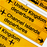
The work done by Kinneir and Calvert on Rail Alphabet was hailed as something of a triumph and was duly coveted by a number of other transport companies from as far afield as Japan. So successful was the typeface that it was subsequently adopted by a number of state railway companies, notably DSB in Denmark. Variants of the alphabet were also used by the Ministry of Defence and by British Airports Authority (BAA) for the signage at the new terminal at Gatwick Airport, designed by Calvert and Kinneir, where the typeface was once again chosen for its many proven virtues.
Nowadays, one or two train operating companies doggedly retain Rail Alphabet in recognition of its outstanding suitability as a public wayfinding typeface. The Rail Safety and Standards Board still specify the font for a number of types of lineside signs. There is also a dwindling number of 'legacy' signs across the national railway network that will no doubt continue to disappear over the course of time as they are replaced with altogether blander and less effective alternatives.
 21st Century revival
In recent times, in recognition of its many strengths, Rail Alphabet has been 'revived' by Henrik Kubel of A2/SW/HK in close conjunction with Margaret Calvert. New Rail Alphabet features six weights with corresponding italics and a full complement of Eastern European characters as well as non-aligning ('old style') numerals. While retaining much of the original character of Rail Alphabet, Kubel's interpretation differs in a number of ways, not least because of 'extended ascenders and descenders to aid legibility in smaller point sizes.'
|
|
|
